In applied statistics and machine learning, data visualization is one of the most important skills. Data visualization is the representation of data or information in graph, chart or other visual formats. It communicates the relationship of the data with images and thus allowing trends and patterns to be more easily seen.
Use Cases in Machine Learning
- Identifying trends, patterns and correlations
- Selecting important features
- Finding outliers - outlier detection
- Validating model assumptions
- Model performance evaluation
- Hyperparameter tuning
Fundamentals of Data Visualization
- Clarity - Data should be visualized in a way that everyone can understand
- Problem Domain - When presenting data, the visualizations should be related to the business problem.
- Interactivity - Interactive plots are useful to compare and highlight certain things within the plot.
- Comparability - We can compare the thighs easily with good plots
- Aesthetics - Quality plots are visually aesthetic.
- Informative - A good plot summarizes all relevant information.
Importance of Data Visualization
- Data cleaning
- Outlier Detection
- Removing multicollinearity
- Data Exploration
- Important to identify dataset characteristics e.g. use of histograms for continuous variables to check for normality in the data
- Check for correlations using scatter plots between two features
- Bar chart to check for class imbalances
- Evaluation of modeling outputs
- Confusion Matrix - measure performance of a model during training
- Residuals plot and histogram for the distribution of residuals to validate the assumptions of a linear regression model
- Identify trends - time and seasonal plots are useful in time series analysis to identify certain trends over time
- Presenting results - communicate the findings to stakeholders using plain English supported with informative plots
Types of Data Visualization
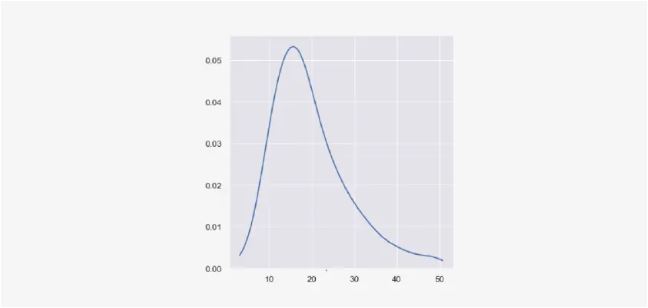
Distribution Plots - A distribution plot is used to visualize data distribution. Example: Probability distribution plot or density curve.
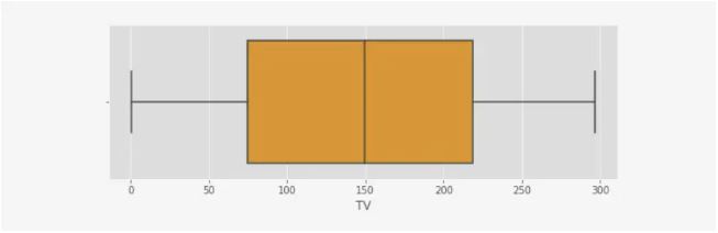
Box and Whisker Plot - This plot is used to plot the variation of the values of a numerical feature. You can get the values' minimum, maximum, median, lower and upper quartiles..
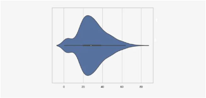
Violin plot - used to plot the variation of a numerical feature. But it contains a kernel density curve in addition to the boxplot
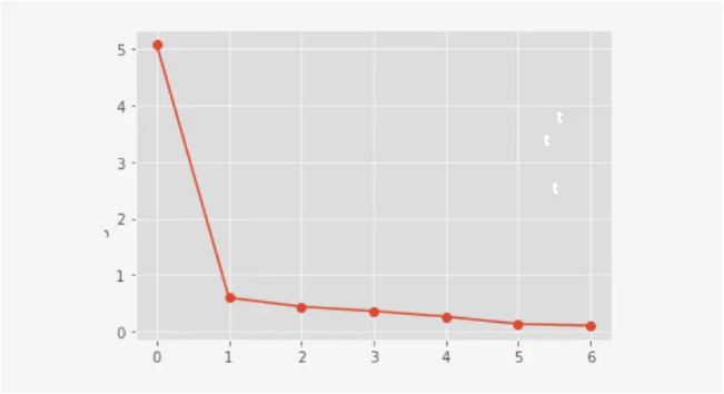
Line plot - A line plot is created by connecting a series of data points with straight lines. The number of periods is on the x-axis.
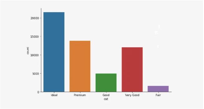
Bar plot - A bar plot is used to plot the frequency of occurring categorical data. Each category is represented by a bar. The bars can be created vertically or horizontally. Their heights or lengths are proportional to the values they represent.
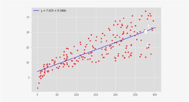
Scatter plot - Scatter plots are created to see whether there is a relationship (linear or non-linear and positive or negative) between two numerical variables. They are commonly used in regression analysis.
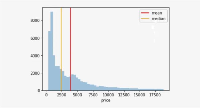
Histogram - A histogram represents the distribution of numerical data. Looking at a histogram, we can decide whether the values are normally distributed (a bell-shaped curve), skewed to the right or skewed left. A histogram of residuals is useful to validate important assumptions in regression analysis.
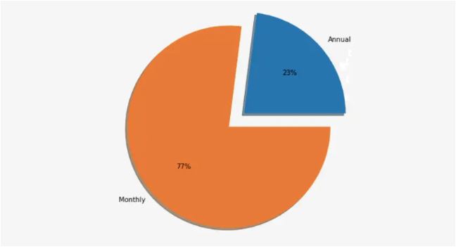
Pie Chart - A categorical variable pie chart includes each category's values as slices whose sizes are proportional to the quantity they represent. It is a circular graph made with slices equal to the number of categories.
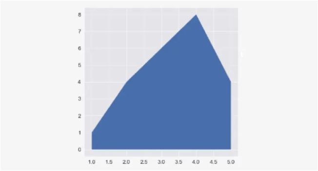
Area Plot - The area plot is based on the line chart. We get the area plot when we cover the area between the line and the x-axis.
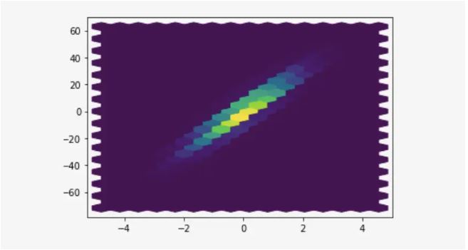
Hexbin plot - Similar to the scatter plot, a hexbin plot represents the relationship between two numerical variables. It is useful when there are a lot of data points in the two variables. When you have a lot of data points, they will overlap when represented in a scatter plot.
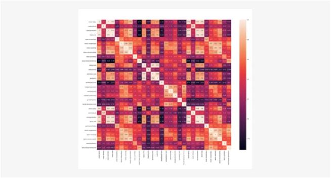
 Heatmap - A heatmap visualizes the correlation coefficients of numerical features with a beautiful color map. Light colors show a high correlation, while dark colors show a low correlation. The heatmap is extremely useful for identifying multicollinearity that occurs when the input features are highly correlated with one or more of the other features in the dataset.
Visualization workflow
- Develop research question - This may be a business problem or any other related problem that could be solved with a data-driven approach. You should note all the objectives and outcomes plus required resources such as datasets, open-source software libraries, etc.
- Get or create your data - The next step is collecting data. You can use existing datasets if they’re relevant to your research question. Alternatively, you can download open-source datasets from the internet or do web scraping to collect data.
- Clean your data - Real-world data are messy. So, you need to clean them before using them for visualization. You can identify missing values and outliers and treat them accordingly. You can perform feature selection and remove unnecessary features from the data. You can create a new set of features based on the original features.
- Choose a chart type - The chart type depends on many factors. For example, it depends on the feature type (numerical or categorical). It also depends on the type of visualization you need. Let’s say you have two numerical features. If you want to find their distributions, you can create two histograms for each feature. If you want to plot their variations, you can create box and whisker plots for each feature. You can create a scatterplot if you want to find a relationship (linear or non-linear, positive or negative) between the two features.
- Choose your tool - You can use open-source data visualization tools such as matplotlib, seaborn, plotty and ggplot. You can also use API-based software such as Matlab, Minitab, SPSS, etc.
- Prepare data - You can extract relevant features. You can do feature standardization if the values of the features are not on the same scale. You can apply data preprocessing steps such as PCA to reduce the dimensionality of the data. That will allow you to visualize high-dimensional data in 2D and 3D plots!
- Create a chart - This is the final step. Here. You define the title and names for the axes. You should also choose a proper chart background to ensure the content is easily readable.
Tools and Software for Data Visualization
Python based:
- Matplotlib
- Seaborn
- Plotty
- Bokeh
- Alair
Data Visualization Techniques
- Univariate Analysis - here we analyze only one variable at a time. In other words, we analyze each variable separately. Bar charts, pie charts, box plots and histograms are common examples of univariate data visualization. Bar charts and pie charts are created for categorical variables, while box plots and histograms are created for numerical variables.
- Bivariate Analysis - we analyze two variables at a time. Often, we see whether there is a relationship between the two variables. The scatter plot is a classic example of bivariate data visualization.
- Multivariate Analysis - we analyze more than two variables simultaneously. The heatmap is a classic example of multivariate data visualization. Other examples are cluster analysis and principal component analysis (PCA).
Practical Implementations
- Students enrolling for any AI related course from Carnegie Training Institute have access to practical and working implementation guidelines
Sources
- Rukshan Manorathna
-