Evaluating the performance of the model using different metrics is integral to every data science project. You build a model, get feedback from metrics, make improvements, and continue until you achieve a desirable classification accuracy. Evaluation metrics explain the performance of the model. There are several evaluation metrics one must know as a data science professional.
Each of the evaluation metrics have their own advantages and disadvantages. The ground truth is that building a predictive model has never been the motive of any data scientist. The motive has always been to create and select a model which gives a higher accuracy_score on out-of-sample data. Hence, it is crucial to check the accuracy of the model prior to computing predicted values.
The choice of performance evaluation metrics depends on the type of model and the implementation plan of the model. Performance evaluation metrics are dependent on the type of predictive models i.e. either regression (continuous output) or classification (nominal or binary output).
In classification problems we have two types of outputs:
Class Output : For instance, in a binary classification problem, the outputs will be either 0 or 1
Probability Output : Converting probability outputs to class output is just a matter of creating a threshold probability.
In regression problems, we do not have such inconsistencies in output. The output is always continuous in nature and requires no further treatment.
Below are some of the metrics you need to keep an eye on:
Accuracy
Is a metric for how much of the predictions the model makes are true.
this is the proportion of the total number of correct predictions that were correct.
Loss
Loss describes the percentage of bad predictions. If the model’s prediction is perfect, the loss is zero; otherwise, the loss is greater.
Precision
Also called the positive predictive value
The precision metric marks how often the model is correct when identifying positive results.
For example, how often the model diagnoses cancer to patients who really have cancer.
Recall
This metric measures the number of correct predictions, divided by the number of results that should have been predicted correctly.
It refers to the percentage of total relevant results correctly classified by your algorithm.
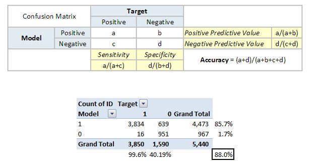
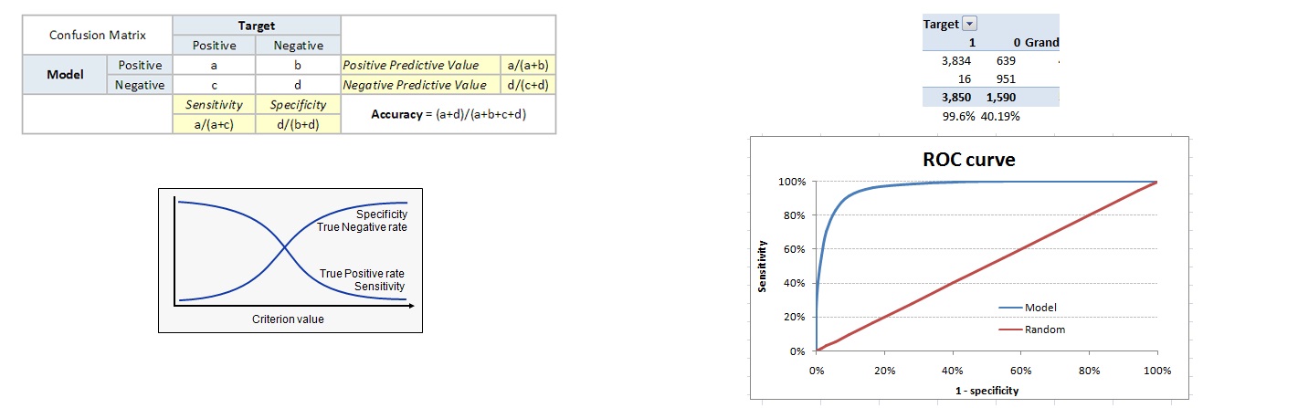
Confusion Matrix
A confusion matrix is an N×N square table, where N is the number of classes that the model needs to classify.
Usually, this method is applied to classification where each column represents a label.
For the problem in hand, we have N=2, and hence we get a 2 X 2 matrix.
It is extremely useful for measuring precision-recall, Specificity, Accuracy, and most importantly, AUC-ROC curves.
Here are a few definitions you need to remember for a confusion matrix:
True Positive: You predicted positive, and it’s true.
True Negative: You predicted negative, and it’s true.
False Positive: (Type 1 Error): You predicted positive, and it’s false.
False Negative: (Type 2 Error): You predicted negative, and it’s false.
Positive Predictive Value or Precision: the proportion of positive cases that were correctly identified. Out of those that were predicted as positive, how many were actually positive.
Negative Predictive Value: the proportion of negative cases that were correctly identified. Out of those that were predicted as negative, how many were actually negative
Sensitivity or Recall: the proportion of actual positive cases which are correctly identified. Out of the actual positives, how many were correctly predicted as positive.
Specificity: the proportion of actual negative cases which are correctly identified. Out of the actual negatives, how man were actually negative.
Rate: It is a measuring factor in a confusion matrix. It has also 4 types TPR, FPR, TNR, and FNR.
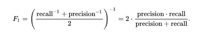
F1 Score
F1 score is the harmonic mean of precision and recall values for classification problem.
This is significant if we are trying to get the best precision and recall at the same time.
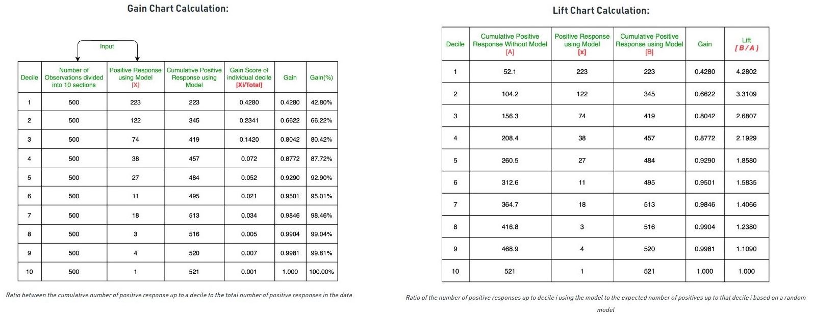
Gain and Lift Charts
The gain chart and lift chart are two measures that are used for Measuring the benefits of using the model and are used in business contexts such as target marketing.
It can also be used in other domains such as risk modeling, supply chain analytics, etc.
In other words, Gain and Lift charts are two approaches used while solving classification problems with imbalanced data sets.
Mainly concerned with checking the rank ordering of the probabilities
The steps are:
Calculate the probability for each observation
Rank these probabilities in decreasing order.
Divide the data sets into deciles. Calculate the number of positives (Y = 1) in each decile and the cumulative number of positives up to a decile.
Build deciles with each group having almost 10% of the observations.
Calculate the response rate at each decile for Good (Responders), Bad (Non-responders), and total.
Gain is the ratio between the cumulative number of positive observations up to a decile to the total number of positive observations in the data.
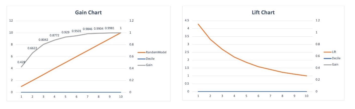
The gain chart is a chart drawn between the gain on the vertical axis and the decile on the horizontal axis.
Lift is the ratio of the number of positive observations up to decile i using the model to the expected number of positives up to that decile i based on a random model.
Lift chart is the chart between the lift on the vertical axis and the corresponding decile on the horizontal axis.
Cumulative Gain chart shows how well the model segregates the classes
Cumulative gains and lift charts are visual aids for measuring model performance.
Both charts consist of Lift Curve (In Lift Chart) / Gain Chart (In Gain Chart) and Baseline (Blue Line for Lift, Orange Line for Gain).
The Greater the area between the Lift / Gain and Baseline, the Better the model.
Area Under the Curve - Receiver Operating Characteristic (AUC-ROC)
it is independent of the change in the proportion of responders.
The ROC Curve is a plot between sensitivity and (1-specificity)
(1-specificity) is also known as the false positive rate
sensitivity is also known as the true positive rate
Therefore the ROC Curve is a plot between the true positive rate and the false positive rate
From the above confusion matrix, you can see the sensitivity is 99.6% and (1-specificity) is ~60%. To bring this curve down to a single number, we find the area under this curve (AUC).
Note that the area of the entire square is 1*1 = 1. Hence AUC itself is the ratio under the curve and the total area. For the case in hand, we get AUC ROC as 96.4%. Following are a few thumb rules:
.90-1 = excellent (A)
.80-.90 = good (B)
.70-.80 = fair (C)
.60-.70 = poor (D)
.50-.60 = fail (F)
Being in the excellent (A) band could also mean an over-fitting model and it therefore becomes extremely important to do the in-time and out-of-time validations.
Advantages of Using ROC
Lift is dependent on the total response rate of the population. Hence, if the response rate of the population changes, the same model will give a different lift chart. A solution to this concern can be a true lift chart (finding the ratio of lift and perfect model lift at each decile). But such a ratio rarely makes sense for the business.
The ROC curve, on the other hand, is almost independent of the response rate. This is because it has the two axes coming out from columnar calculations of the confusion matrix. The numerator and denominator of both the x and y axis will change on a similar scale in case of a response rate shift.